Composition is the decision about where things go. Form is what they are once they get there — the shape, the mass, the edge. Everything else in a picture is detail, and detail is the part you notice last. Composition and form are what you feel in the first half-second, before you have identified a single object, and they are the reason one arrangement of marks feels calm and another feels like an argument.
That is good news for anyone who thinks they do not know enough about art to have an opinion. You do not need a vocabulary to see that a figure crowded into a corner feels trapped, or that one red shoe in a grey street is impossible to look away from. You already read composition fluently. What the vocabulary adds is the ability to say why, and once you can say why, you can use it — in your own drawings, in your photographs, or just in deciding which print to hang above the sofa.
This page is the shortest route through the fundamentals. Five essays, in the order we would read them: where the reduced outline came from, how the emptiness around a subject does the work, how to look at abstraction without the jargon, what a single colour can do to a monochrome image, and how to start buying reductive art without being fleeced. Each one stands alone. Together they are the whole grammar.
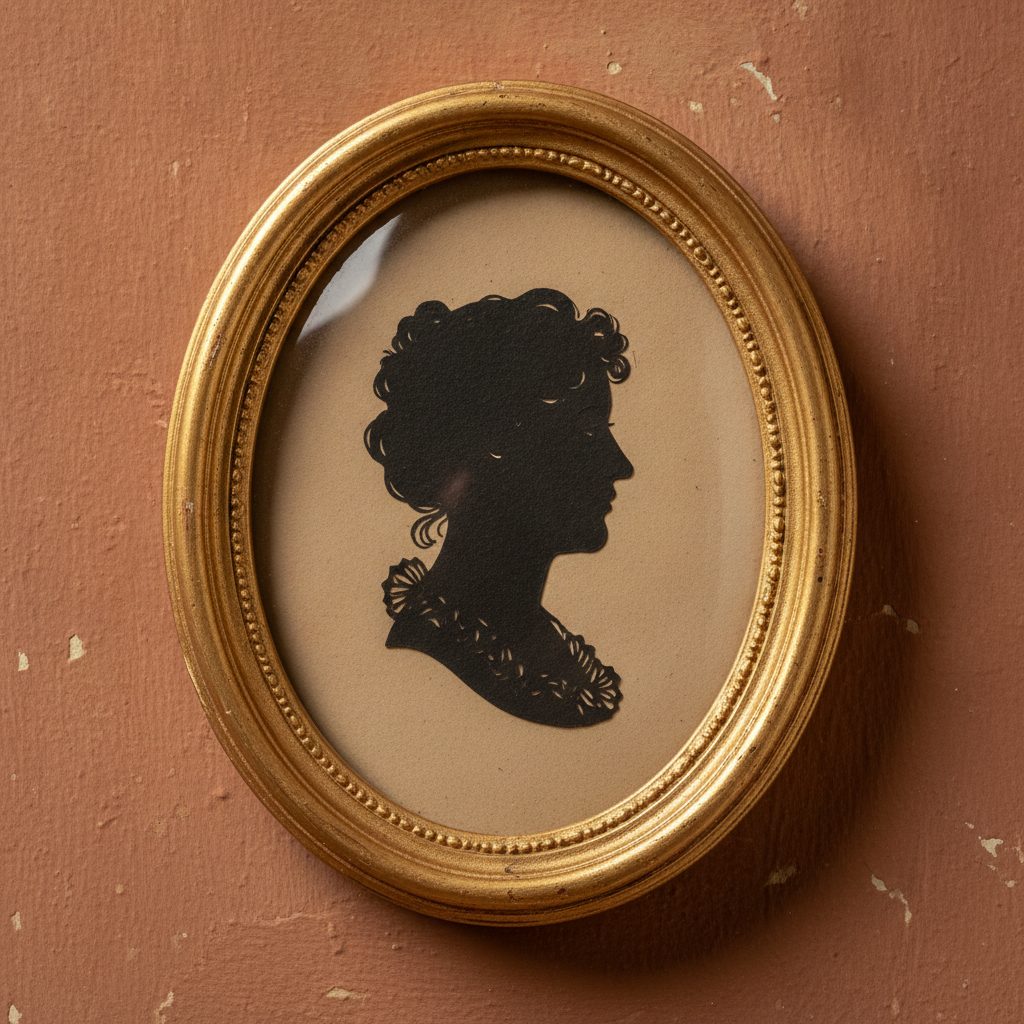
The history of silhouette art
Start where form starts: with a shadow traced on a wall. For a century the cut-paper profile was the only portrait ordinary people could afford, and the name came from a finance minister nobody liked. It is also the purest lesson in form there is — strip out every detail, keep only the outline, and a whole person is still recognisably there.
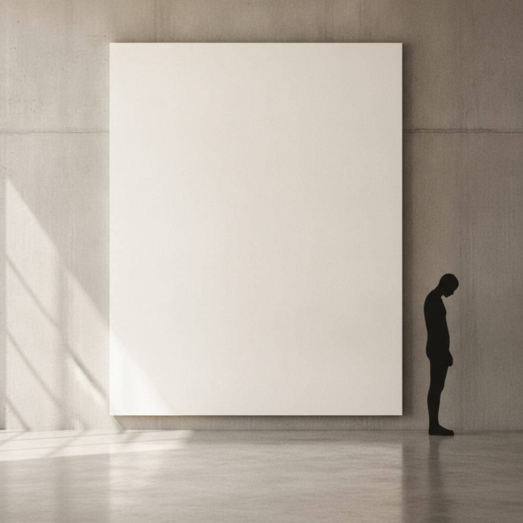
Negative space in art
The single most useful idea on this page. The area around and between your subjects is not leftover background — it is an active shape with its own outline, and moving it changes what the picture means. Includes the figure–ground flip, twelve examples from Rubin’s vase to the arrow hiding in the FedEx logo, and a working method for drawing the gaps instead of the object.
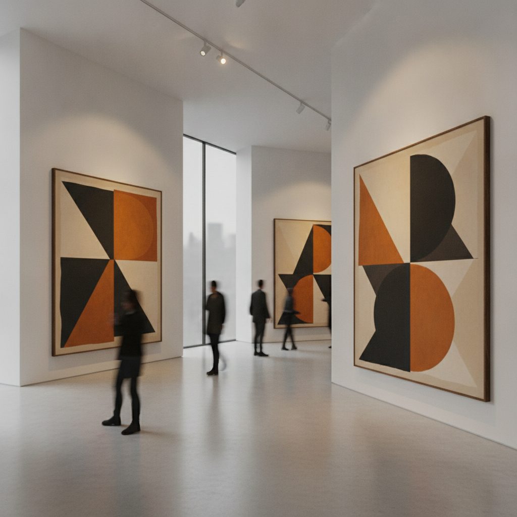
Reading abstract art without the jargon
Once a picture stops depicting a recognisable thing, composition and form are all that is left — which is exactly why abstraction feels unreadable until someone hands you the method. A practical order of operations for looking at a reductive painting: shape first, then edge, then scale, then colour, then the title. The wall text comes last, if at all.

Colour isolation in black-and-white art
Composition decides where the eye goes; one saturated colour in a grey field decides it faster than any arrangement of shapes can. From the girl in the red coat in Schindler’s List to Sin City to the lone red sole in a monochrome photograph — why the isolated accent is impossible to ignore, and the point at which the trick turns into a cliché.

Collecting minimalist art
The practical end of the subject. Reductive art is one of the few corners of the market where a small budget still buys something good, provided you understand editions, provenance, paper and light. What an edition number actually means, why framing and glazing matter more here than anywhere else, and the questions to ask before money changes hands.