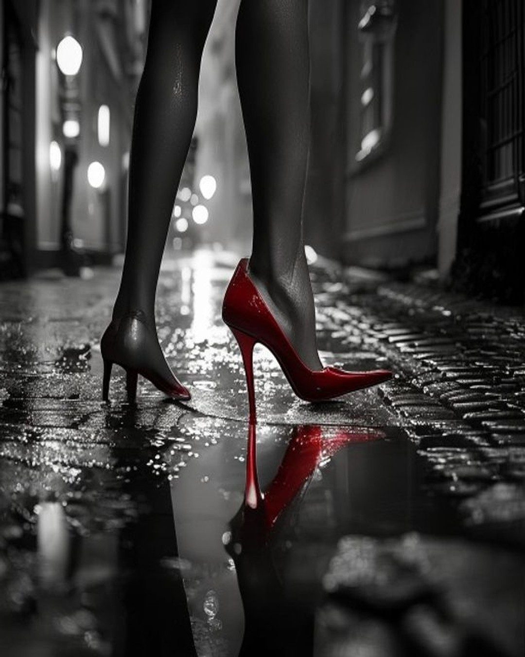
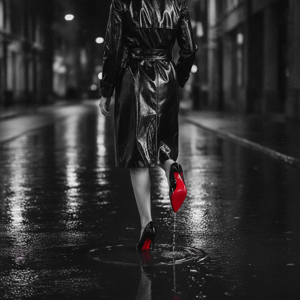
Take almost all the colour out of an image, leave a single object glowing red, and something strange happens: the eye stops wandering. It goes straight to the red and stays there. This is colour isolation — also called selective colour or spot colour — and it is one of the most reliable effects in the whole visual toolkit. The photographs in this series live entirely on it: a grey city, a black figure, and one unmistakable stroke of scarlet.
Why the eye can't refuse it
The effect isn't taste; it's biology. Human vision is built to notice contrast, and a warm, saturated colour surrounded by neutral greys is about as much contrast as you can offer it. Red also happens to be the colour we react to fastest and hardest — it is the colour of blood, ripe fruit, fire and warning signs, and the brain treats it as urgent. Put that one urgent note in an otherwise silent, monochrome frame and you have engineered attention. The viewer looks exactly where you want, in the order you want.
Desaturate everything and you don't lose colour — you concentrate it. What's left has all the power the rest gave up.
The girl in the red coat
The most famous use of the technique is also the most devastating. In Steven Spielberg's Schindler's List (1993), a film shot almost entirely in black and white, a small girl in a red coat walks through a ghetto liquidation. She is the only colour in the scene. Later we see the coat again, on a cart of bodies. Spielberg used isolation not for style but as a moral spotlight — one child made impossible to look away from, and then impossible to forget. It is the clearest proof that a single accent is never neutral: it says this one matters.
Frank Miller's Sin City pushed the same idea the other way, toward pure style — a stark black-and-white world punctuated by shock hits of red: a dress, lips, blood, a pair of heels. And advertising has quietly relied on colour isolation for decades, greying out a whole scene so that one product, one bottle, one sole, carries all the heat in the frame.
A technique as old as the silhouette
It is tempting to think of selective colour as a digital gimmick — the sort of thing a photo app does with one tap. But the instinct behind it is ancient. It is the same instinct that made illuminators of medieval manuscripts spend their most precious pigment, vermilion, on a single initial letter. The same one that led Japanese printmakers to hold a composition in restrained greys and let one red seal punctuate it. Colour was expensive and meaning was scarce, so both were spent carefully, on the one thing that had to be seen.
The silhouette works by subtraction — remove colour, texture and detail until only an outline remains. Colour isolation is subtraction with a single exception: remove almost all the colour, and let one survivor speak for the rest. They are two moves in the same language. One leaves everything out; the other leaves out everything but one.
How to use it without ruining it
The technique is easy to do and easy to overdo. A few principles separate the elegant from the tacky:
- Isolate one thing, not five. The power is in scarcity. Two red objects halve the effect; a scattering of them turns a spotlight into confetti.
- Let the accent lead the composition. The red should sit where you want the eye to begin — and ideally where it should travel next. In these images it is the heel, low in the frame, so the eye climbs the figure from the ground up.
- Keep the rest genuinely quiet. The greys must be truly desaturated. A little leftover colour elsewhere and the red has competition; the trick collapses.
- Choose red for a reason. It carries the most charge, which is why it dominates the genre — but a lone gold, or a single cold blue, isolates just as hard and says something else entirely.
Done well, colour isolation feels less like an effect and more like an argument. It tells you what the picture is about before you have consciously read a single shape. In a frame of shadow and rain, a red heel is not just a shoe. It is the sentence the whole image was built to say — and, as the previous essay showed, occasionally it is a trademark too.