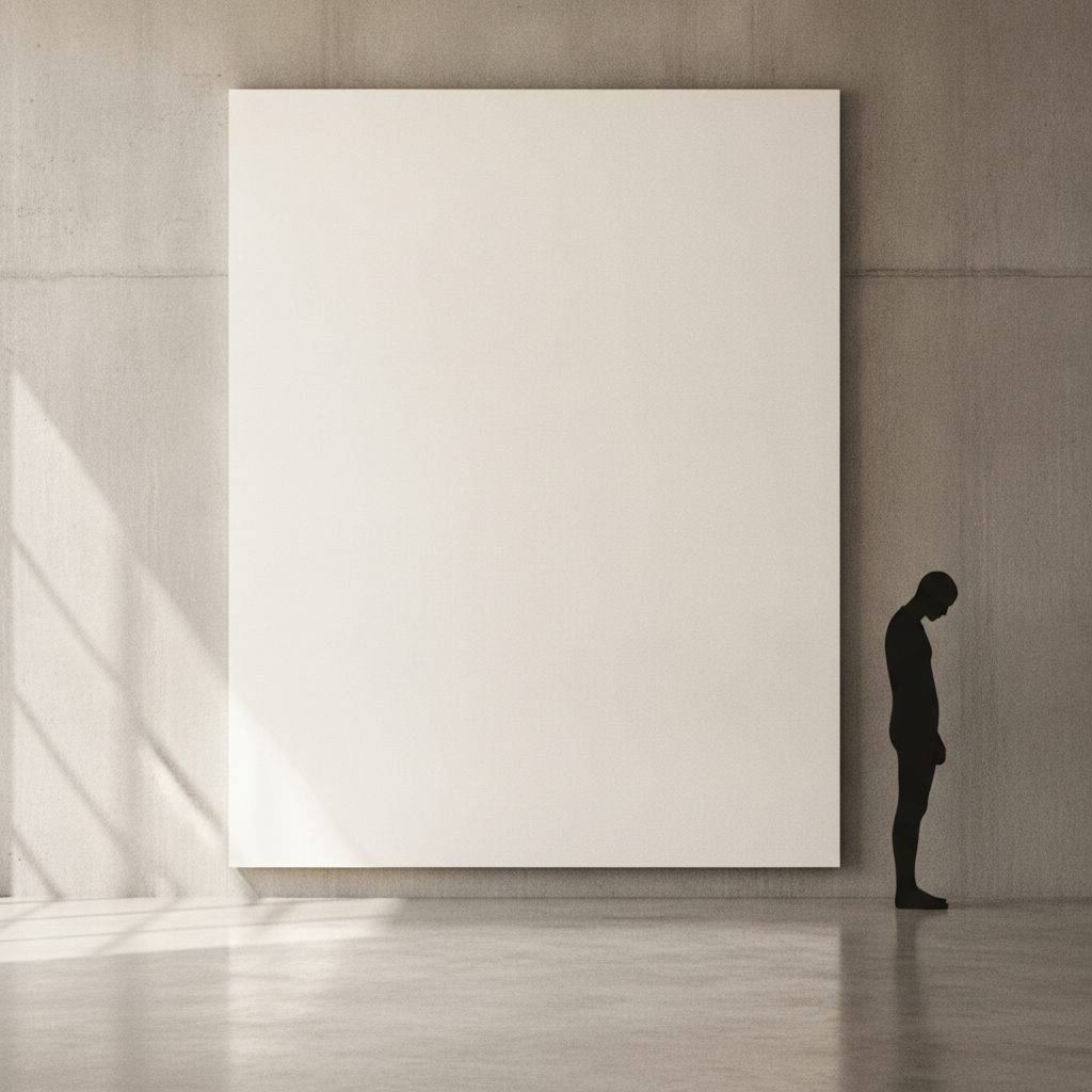
Ask most people what a picture is about and they will point at the subject — the face, the vase, the mountain. But an artist spends just as long thinking about everything the subject is not: the air around it, the gap between two figures, the pale margin that lets a shape breathe. That is negative space, and it is not empty. It is doing work.
Figure and ground
Painters and designers split any image into two things: the positive space (the subject) and the negative space (everything else). The two are not decoration and background. They are a pair, locked together — change one and you change the other. A silhouette is the purest demonstration of this: the black shape and the white ground are cut from the same edge, so you literally cannot draw one without drawing the other.
When the balance tips, your eye notices even if your mind can't say why. Crowd a figure into a corner and the picture feels tense, trapped. Float it in a wide, calm field and it feels dignified, alone, monumental. None of that is in the figure. It is in the emptiness.
The space that isn't there is the part you feel first and name last.
The vase that is also two faces
The most famous lesson in negative space is Rubin's vase, the optical illusion where a white goblet is also two black profiles staring at each other. It works because your brain is forced to choose which part is "figure" and which is "ground," and it can flip. That flicker is the whole principle made visible: ground is never passive. Given the chance, it will become a subject of its own.
Good designers exploit this on purpose. The arrow hidden in the FedEx logo, the panda formed by the empty spaces in the WWF mark — these are negative-space jokes that reward a second look. The lesson travels straight from fine art to the shape of a brand.
Ma: the Japanese art of the gap
Western art discovered negative space slowly. East Asian art built its whole aesthetic on it. The Japanese concept of ma (間) — usually translated as "the interval" or "the pause" — treats empty space as an active, meaningful element, not a leftover. In an ink painting, a vast area of untouched paper isn't unfinished; it is fog, water, sky, silence. The single branch matters because of the emptiness it sits in.
You can feel the same idea in a well-set page, a slow passage of music, or a stage where one actor stands in the dark. Ma is the recognition that absence has weight.
How to actually see it
Negative space is a skill you can practise. Three exercises artists use:
- Draw the gaps, not the object. Instead of drawing a chair, draw the oddly shaped holes between its legs and rungs. Your hand stops relying on what a chair "should" look like and records what is actually there — a classic trick from Betty Edwards' drawing method.
- Squint. Half-closing your eyes flattens a scene into blocks of light and dark, and suddenly the shape of the background reads as clearly as the subject. It is how painters check their composition.
- Turn it upside down. Rotate an image and the "meaning" drops away, leaving only shapes and gaps. If the composition still feels balanced upside down, the negative space is doing its job.
Emptiness as confidence
There is a reason luxury brands, modern galleries and the best minimalist art all leave so much room. Empty space signals control. It says: I don't need to fill every inch to hold your attention; I trust the one thing I've placed here. Matisse spent a lifetime learning to say more with less, ending in cut-outs where a few floating shapes and acres of white say everything.
That is the paradox at the centre of this whole journal. The silhouette leaves out colour, texture and detail; negative space leaves out subject entirely. And both, by leaving out, end up saying more. Emptiness isn't the absence of art. Handled well, it is the art.